Simplifying customer management through design
CMS Case Study
About the company
All My Sons Moving and Storage is a moving company with over 80 locations across the US. They offer various move types and services, including same-day moves. To handle their large customer base, they have sales teams at each location and a dedicated sales force in Dallas, TX.
AMS sales reps rely on the Customer Management System (CMS) to create customer profiles and manage their move details. CMS connects with other systems to maintain consistency throughout the moving process. It serves as the foundation for managing customer profiles from sales to operations and beyond.
Project objective
In 2012, our in-house team developed CMS, a web application. While we added features over time, the infrastructure remained the same. This resulted in an outdated product that lacked navigational hierarchy, and users depended on outside programs for daily tasks due to technological limitations.
To address these issues, our primary goal was to build a new CMS, version 2.0, with integrated technology, improved functionality, and better data management. Initially, the new web application will be available to the AMS sales force, and based on its performance, we plan to expand it to other departments and consolidate all technology into CMS.
My Role
UX Research
UI Design
Site Testing
Skills Applied
User Research
Design System
Wireframing
Prototyping
Usability Testing
Tools Used
Figma
Material UI
Jira
Slack
Design Process
User research
The CMS tool is crucial for the AMS sales team. Sales representatives utilize CMS to gather information about their moving requirements when reaching out to customers. This information is shared with other departments throughout the moving process, making it vital that all details are accurate from the initial customer interaction.
As I collaborated with the Sales Center, I identified the various roles that constitute the sales force and their specific requirements for CMS. My focus was on the majority of users within the Sales Center.
Sales Agents
User Needs
Communicate with customers
Collect and update customer information
Collect deposit for moves
Estimators
User Needs
Communicate with customers
Update move information
Schedule estimate appointment
Sales Managers
User Needs
Monitor sales performance
Sales support and management
Communicate with customers
Pain Points
After understanding the requirements of different sales roles, I inquired about the challenges they faced with CMS. The majority of their concerns were related to the overall CMS experience.
I categorized the feedback into three main areas, and implementing improvements based on these pain points would enhance the user experience for all sales users.
Layout and Navigation
Managing workflows with multiple open pages can be challenging due to clutter and design inconsistencies. Menu access limitations based on user roles are also unclear.
Call Controls
The tool is useful, but takes up a lot of screen space and isn't integrated into the CMS. Navigation is aided by icons and labels, but there are functional problems. Additionally, some unrelated functions are included.
Data Management
Collecting information through data entry forms can hinder customer engagement during phone calls and cause problems with saving and updating data.
User Persona
I based the user persona on the sales agent role since they perform essential functions in CMS and are affected by all pain points. Therefore, I identified them as the primary users for CMS 2.
Reference Material - Customer Quote Form
The customer quote form used on AMS websites improved the customer form-filling experience. Adapting this experience to CMS could enhance sales agent-customer interactions and data management.
Design Goals
Design a layout that organizes primary and secondary functions, supporting elements, and simplifies menu navigation. Expand and hide content based on current activity while limiting horizontal scrolling with dynamic layouts.
Revamp customer information forms as step-by-step processes. Store and modify customer data upon completion. Provide data management aids.
Display only essential call control features within the CMS application and relocate unrelated functions. Expand for additional options.
Layout Wireframe
I created wireframes with a flexible layout for different users, including sales agents. This helped me understand the available space and balance. Now, I am working on designing some concept variations.
Key Features
Navigation Sidebar
Main Activity Section
Supporting Elements Section
Call Controls Widget
Alerts/Notifications Card
User Profile/Status
Early Concepts
With the concept variations, I better understood how space, color, and data could be displayed in the general layout. Each concept includes two pages that I expected Sales Agents to interact with often: a dashboard and a sample of a customer information page.
A majority of the feedback I received was in favor of the Concept C pages. This would help me establish some of CMS's initial components and styling.
Concept A
Concept B
Concept C
Designs - v1
Usability Testing
Designs - v2
Final Designs
Final Product
KPI Dashboard
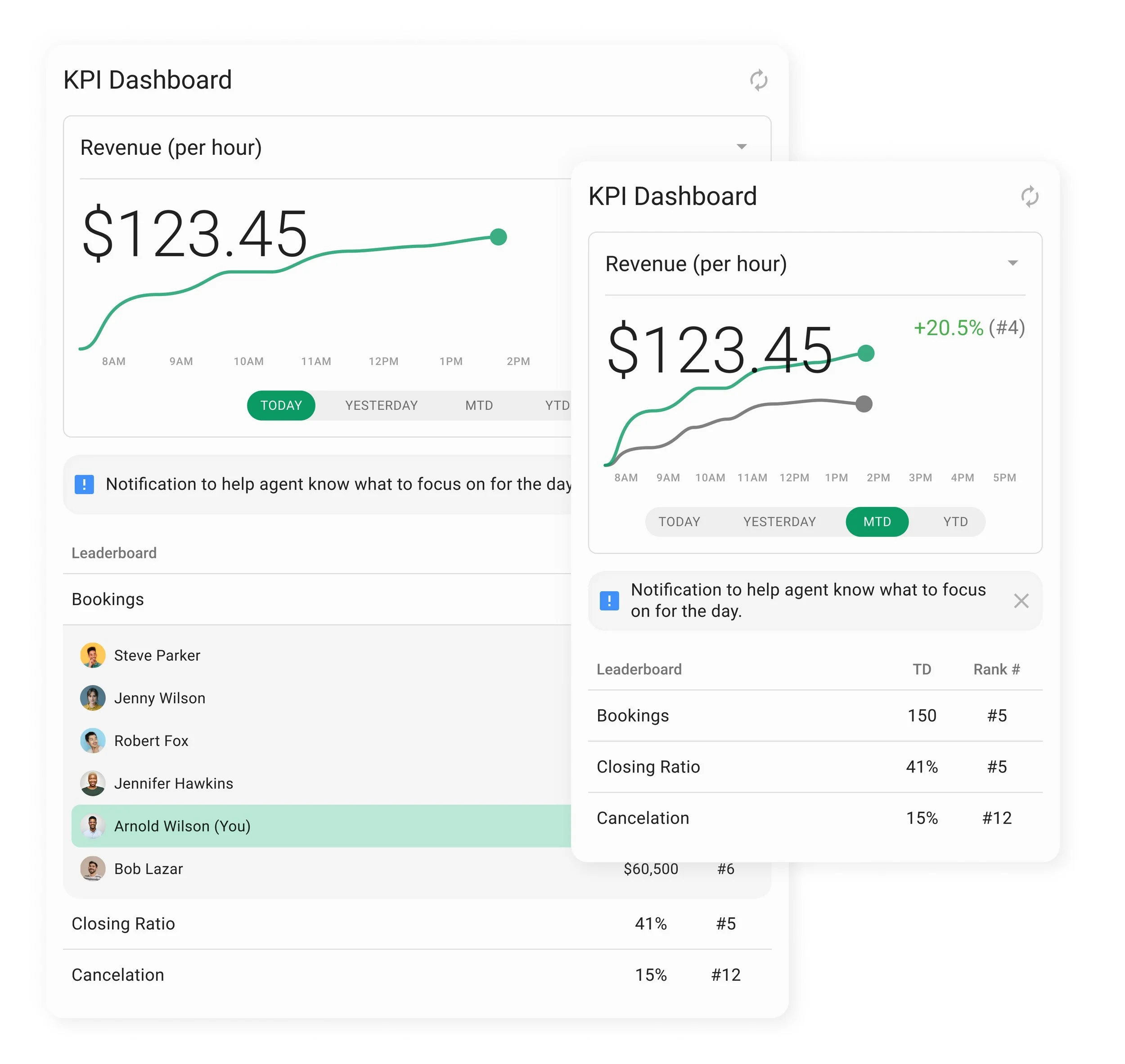
The KPI Dashboard is one of the most essential tools for sales agents. It is the first and last thing they see after logging into CMS 2.0.
My goal was to design the dashboard to be visually intuitive. Users need to analyze their progress and continue with their usual workload efficiently.
Key Features
Display multiple data points based on the user’s current performance throughout the day
Ability to compare data to previous periods
Notifications to assist user
Leaderboards with rankings to compare to other users and create friendly competition
Viewable in Stealth Mode and in between calls, disappears when user engages in a call with a customer
App Bars
App Bars are designed to provide users with tools and functions tailored to their needs. Sales agents can access three different app bars: the Nav Bar, the Customer Toolbar, and the Status Bar, which includes Call Controls.
Nav Bar
Serves as the top-level navigation menu, available for all user types
Includes menu items specifically for Sales Agents
Customers - database of customer and their move information
Teams - database of company departments and employee information
My Account - user information and functions
Menu panels display essential information to view without navigating away from the current primary function
Includes ability to open primary functions, like calling a customer and opening up their account
Customer Toolbar
Active only when a customer account is open and displays information relevant to that specific customer
Customer details summarizes information collected to review at any time during a call
Notes are used to log sales interactions, write custom notes and create notes for the moving crew assigned to the customer
Status Bar/Call Controls
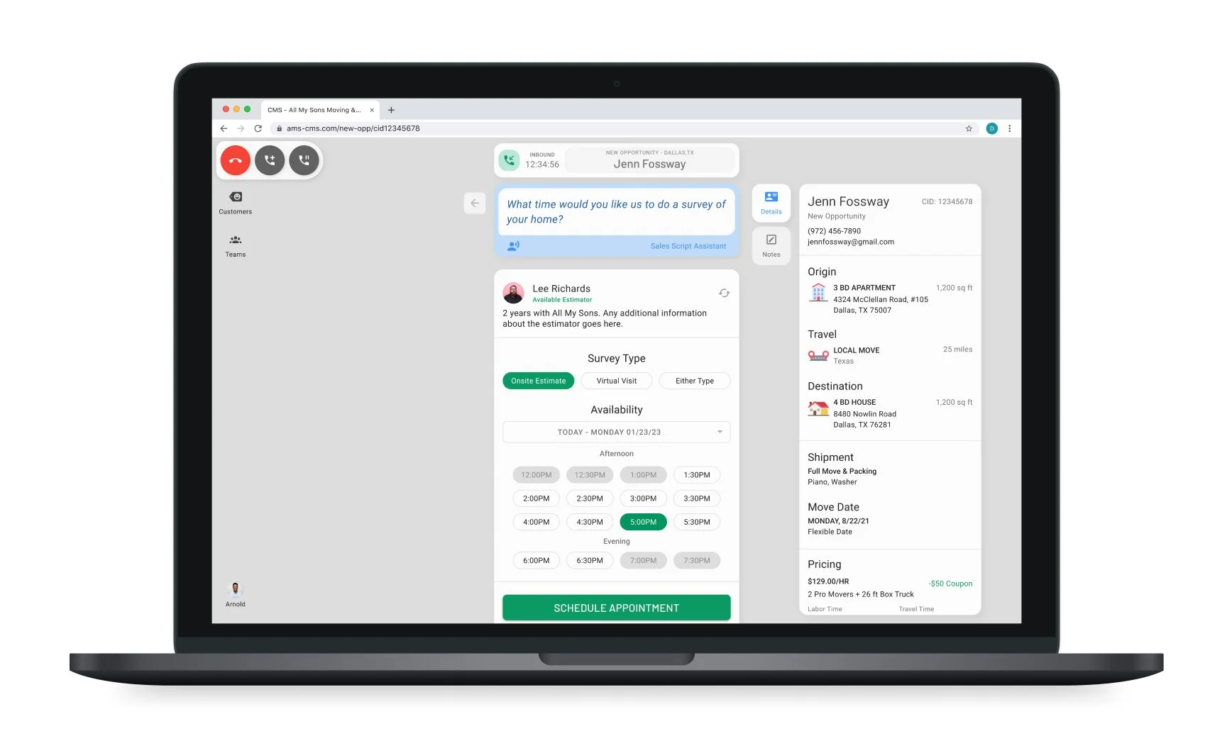
Simplified controls tailored for automated call functionality
Caller ID and time log
Begins Customer Journeys as primary functions
Advanced call options
Customer Journey
The Customer Journey is a dynamic flow for collecting and managing customer information, adapted from the customer quote form to improve sales agent interactions with customers.
Key Features
Simplifies the process for collecting customer information during a call, allowing user to focus more on the call interaction
Dynamic flow based on a customer’s specific needs
Script cards guide users through every step of the sales process
Intuitive controls and tools meant to improve overall user experience
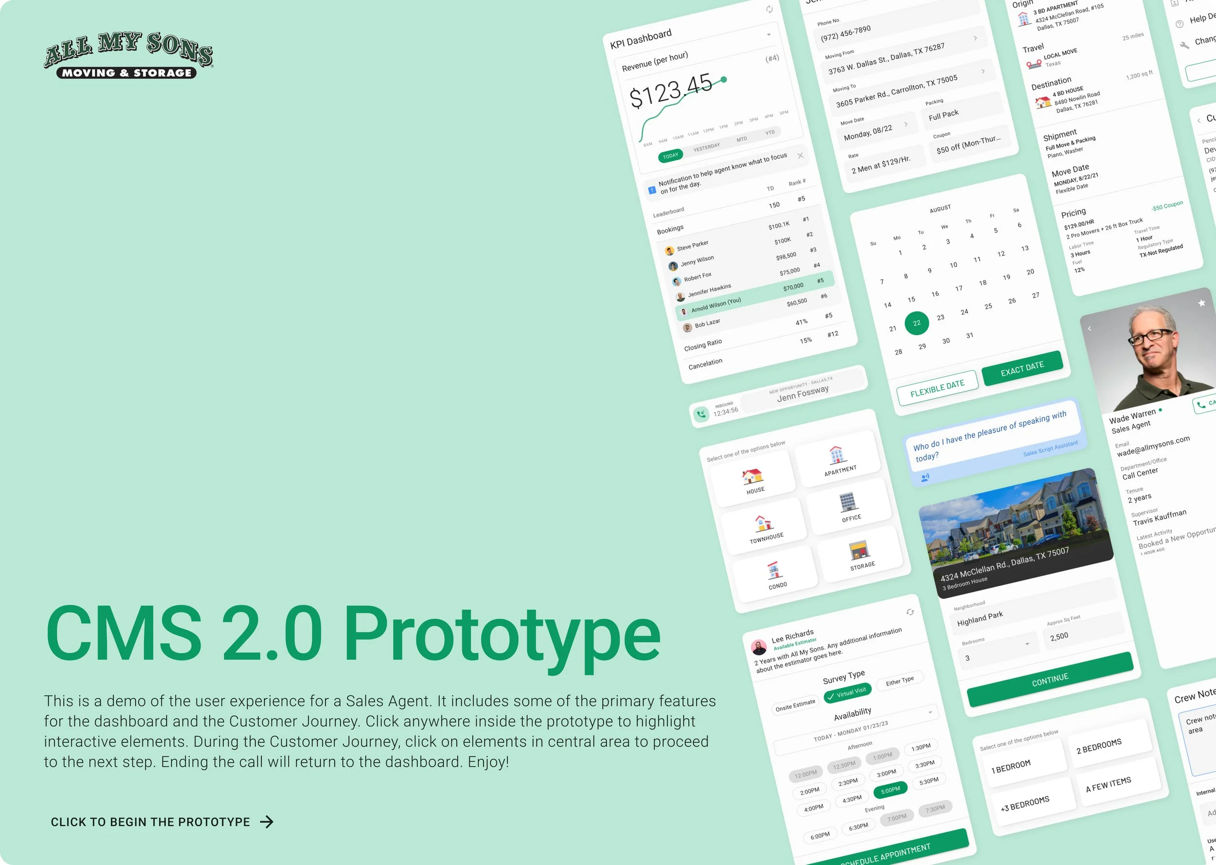
Prototype
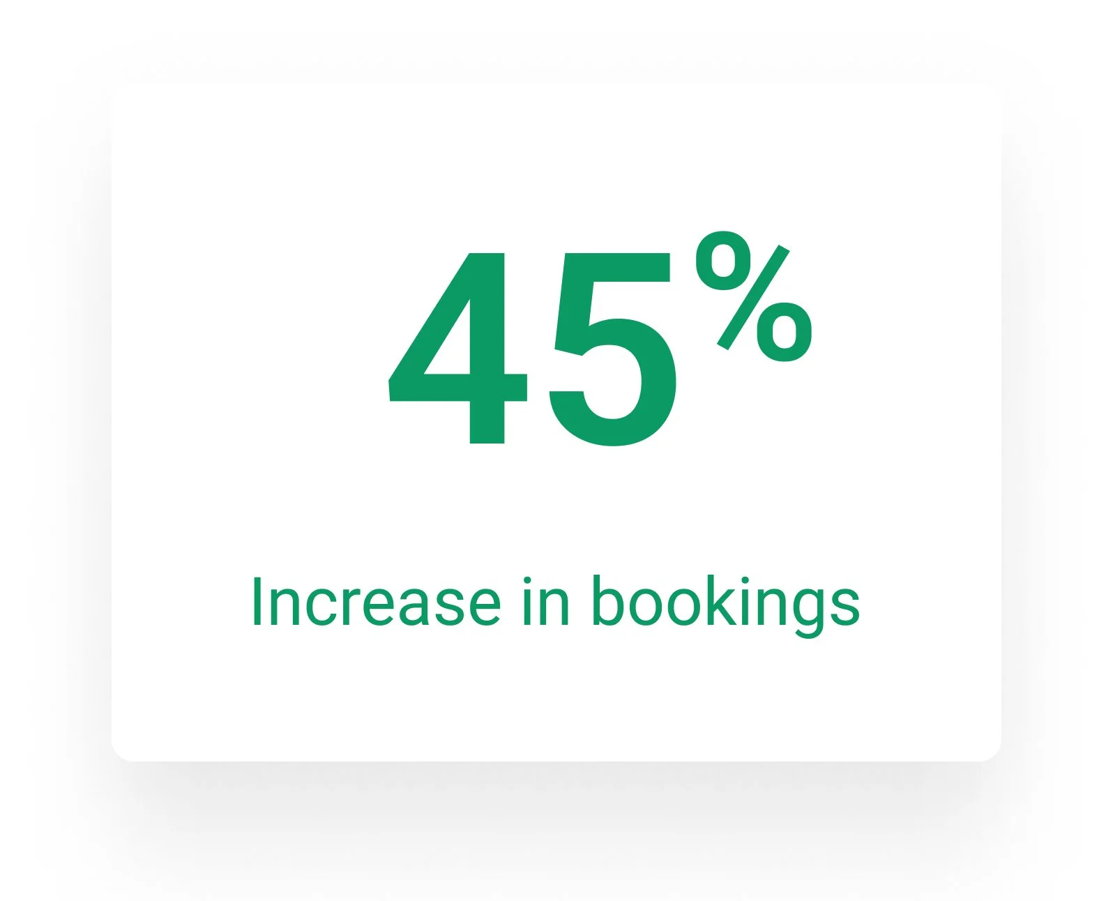
Product Performance
These performance analytics are for the Sales Center from 2020 to 2021. The results are based on data after using CMS 2.0 for one year.
Works in Progress
The launch of CMS 2 for Sales Agents was successful after a year of design and development. While the Sales Agent experience is currently live and being refined, the aim is to extend CMS 2 to cater to other users too.
I have designed some features that are still in progress. Though they are not yet fully live, they are intended for future implementation.
Virtual Visit
The purpose of the Virtual Visit is to improve the way Estimators provide move estimates for customers. Previously, estimates could only be done in person; however, due to the risks posed by COVID-19, All My Sons opted for a safer alternative. To achieve this, I created a desktop experience that cleverly blends video call features with the tools Estimators require to gather information.
Admin Dashboard
Inspired by the Sales Agent KPI Dashboard, the Admin KPI Dashboard offers performance visibility at a branch level. The dashboard is designed to take up most of the page, with segments dedicated to specific functions.
The dashboard provides Sales Admins with in-depth information for all branches and includes tools to improve analysis.
Styleguide
Color Palette
Typography
Icons
Surfaces
Components
Final Thoughts
I learned so much from working on this project. As it grew, I realized how important it was to stay organized and keep track of different versions of our design files over time.
It was amazing to watch the project go from ideas on paper to a fully functioning product. Design was just one part of a much bigger picture, and I got to work closely with people in many different roles. This experience taught me a lot about how to communicate effectively and manage my time well.
There were definitely some challenges along the way, but seeing the finished product and how much it improved the user experience made it all worth it. I'm proud that my work had a lasting impact on the company and its employees.


